Fashion Catalog vs. Lookbook
Fashion catalogs and lookbooks may appear to be the same product, but that could not be further from the truth. Each of these booklets have different strengths and weaknesses that differentiate them from each other and both are important for marketing in the fashion industry. Below we will go over what these similarities and differences are, who can benefit from these products, and how to design these products to drive sales.
What Is the Difference Between Fashion Catalog and Lookbook?
Definitions
Let’s start with the most basic; defining catalog and lookbook. According to issuu blog, “A fashion catalog displays a clothing brand’s collection, or full offerings, with all of the details included. Catalogs are used for wholesale and purchasing needs” Lookbooks on the other hand are much more photo-heavy, being used to focus consumers on the visual storytelling of the products.
Qualities
If you flip through a catalog and a lookbook, some clear differences in content and style are going to pop out to you. Firstly, catalogs use a mix of large and small images to display their products. They usually include product descriptions, item numbers, and prices. Fashion or product catalogs will also have more plain or technical imagery that is designed to show the products’ functionality.
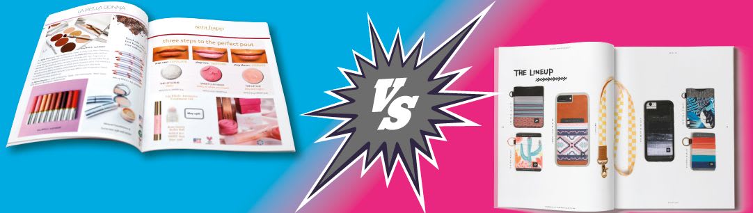
In the image below you can see the combination of text and images, showing the products in action, product mockups, and closeups of some of the ingredients used. On the left page there is a large description of the eyeshadow pallet.

For more information on how to create a captivating catalog, see our blog post: 4 Steps for Printing a Fashion Catalog for a Start-Up.
When you flip through a lookbook, you will mainly see large, full page images or spreads, barely any text, and artistic photos. A catalog is used more to sell the utility of the items whereas a lookbook is used to sell the aesthetic or feeling of the items. In the image below you can see an example of what a lookbook could look like: minimal text, a high-quality spread and colorful images. It’s grouping products of similar color tones together to create this spread.

For more information on how to create a lookbook, check out our blog: How to Make a Lookbook Blog.
What Businesses Should Use a Catalog or Lookbook?
Many different kinds of industries can benefit by sending out catalogs: fashion/ apparel, home décor, mechanical/ industrial, beauty, jewelry/ accessories, food/ beverage, pets, and more! Catalogs are mainly for businesses that have a wide array of physical products to sell. Although lookbooks are usually associated with the fashion industry, they can be used for much more. Home décor, sports apparel, architecture, and design businesses can use lookbooks to advertise their products and services.
What Benefits Do They Have?
Now that we have touched on what businesses use catalogs and lookbooks, let’s go into why. Print marketing has several benefits that digital cannot compete with. For example, people trust print ads more than digital ads. In a study done by Marketing Sherpa, they found that print advertisements were the number one trusted advertising method compared 12 other advertising methods! These included TV radio, social media, search engine, and mobile ads. Not only do people trust print ads more, they remember them better! According to Mediaspace Solutions, “while digital content is scanned quickly, paper-based reading is slower and more deliberate, leading to greater rates of comprehension and recall.”

Not only do we have research showing the positive affect that print media has on consumers, but we have supporting evidence that these affects lead to an increase in sales and inquiries. Businesses that sent out catalogs and emails experience a “49% lift in sales and 125% lift in inquiries when compared to the control group. In comparison the ‘email-only’ group had a 28% increase in sales and 77% lift in inquiries over the control group.” So we can see that there is a clear positive correlation between sending out catalogs and lookbooks to customers and an increase in sales.
The Overview of Catalog and Lookbook Qualities

Designing a Catalog or Lookbook
Images
When taking photos for catalogs and lookbooks, there are different goals that the photographer has to keep in mind. If you are creating images for catalogs, you want to show more how the products can be incorporated into the customers’ daily lives. Shots of the products in use, in locations where they are going to be used most, and more functional/ technical shots are all great.
If you are taking photographs for a lookbook, try to capture the feeling behind the brand or the products. If you are selling high-end fashion, capture luxury, sophistication, and poise. Make sure that you are using a high-quality camera since lookbooks are mainly comprised of large photos or spreads.
Regardless on whether you are creating a catalog, lookbook, brochure, or book, make sure that when you are designing your product that your images are at least 300 DPI (dots per inch) to get the best quality. Don’t worry if the DPI is much larger, we can handle large file sizes! But if the DPI is much smaller, it is going to make your pictures look fuzzy or out of focus when your product is printed. To ensure that your photos are at the highest DPI, try to get the raw files from the camera’s SD card. Don’t use photos that have been emailed to you, downloaded off of Facebook, or off the internet since all of these methods will have compressed your photos and reduced the DPI. If you have to get your photos from a different source, ask if your photographer can share the raw files through a link in Google Drive or another file sharing service. For more information on how to check or change your resolution for your photos, see our Help Center.

Text
When customers receive a catalog, they expect to be educated about your products. This means that you should include product descriptions, price, item numbers, and benefits in your catalog design. Additionally, you can include limited time promotions to encourage customers to purchase from you. Make sure that you have a good balance of text to images; you don’t want to get too wordy and risk boring your audience.
If you are designing a lookbook, you are much more limited on the amount of text that you should have. The focus of the lookbook should be your images. You can include text to title the collection that you are showing, but that is pretty much it. Do not include prices or product descriptions. If you feel like you need to do that, you are creating a catalog, not a lookbook.
Binding
The most popular and professional looking binding types for catalogs and lookbooks are Saddle Stitch and Perfect Bound. Saddle stitch is a method of binding where your product is printed on both sides, collated in page number order, folded in half, and stapled through the fold. This binding type is very affordable and is perfect for booklets that are between 8 and 96 pages (including the front and back cover). For more information on saddle stitch, or to get a quote, click here.
Perfect bound is where your project is printed on single sheets, collated in page number order, and gathered into a book block. The spine edge is ground off and the softcover is placed over and around the book and attached using a strong PUR glue around the binding edge to create a professional-looking square spine. This kind of binding is ideal for projects that have a larger page count and can be between 28 pages and 2” thick. For more information on perfect bound, or to get a quote, click here.

Layout
When determining how to design the layout of your catalog there are a few things to keep in mind: balance, white space, and navigation. Balance refers to the ratio of text to images within your catalog. As we briefly covered earlier, you don’t want your text to overwhelm your images or vice versa. White Space is the blank areas between your images and text and around your page. Do not underestimate the power of white space. It can help make your catalog look less cluttered and more organize. Choosing to leave some padding between images and text is highly recommended to give your text some breathing room. Finally, navigation: your catalog should be intuitive for your readers. Including a table of contents, page numbers, and grouping like-minded products together will help your readers find what they are looking for quickly. For more information on graphic design for a catalog, see our catalog design blog.
To create the layout of your lookbook think of how each photoshoot or section compliments the others. All of the images should flow together to create one cohesive unit. It may be helpful to sketch out your layouts and page sequences so that you can plan how your lookbook is going to appear. We recommend starting strong and finishing strong, meaning starting and ending your lookbook with a strong, captivating, photo or spread. Entice your audience to continue to flip through your lookbook.
Design for Print
Designing for print is much different than designing for digital marketing. You have to take your colors, images, and file settings very seriously to create high-quality, print-ready PDF files. When creating your print-ready files, make sure that your design software is set to CMYK instead of RGB. This is because CMYK is the color spectrum for how print products are printed. It’s important to set this up at the beginning of your design process so that none of the colors on your images or pages change. For more information on how to convert RGB to CMYK, see our blog post.

As stated earlier, make sure that all of the images that you are using are at least 300 DPI. In products that are so image-heavy, like catalogs and lookbooks, this is especially important.
Finally, when creating a print-ready pdf, set up the recommended bleed and trim areas in your document at the beginning of your design process. For printing with PrintingCenterUSA the trim line indicates where to trim the printed sheet or where the edge of the paper is. The bleed line should be 1/8” outside of the trim area of your printing piece. Bleed refers to when an image is printed on a sheet of paper and cut down to size with the appearance that the image bleeds off the edge of the paper. Creating print-ready PDFs has never been easier when you use one of PrintingCenterUSA’s free downloadable clothing catalog templates. We provide fashion catalog templates for Adobe Illustrator, InDesign, Photoshop, and PDF. See our selection of downloadable templates here. If you don’t have a design software, we would recommend using our free online design tool. All you have to do is upload your photos and drag and drop your elements onto the fully editable page. Once you have done that, you can check out straight from your design tool! Start your design now.
If you need more information on how to make your file print-ready, check out our blog post: Learn More.
Printing with PrintingCenterUSA.com
No matter whether you decide to make a catalog or a lookbook, you are sure to get a high-quality product no matter what when you print with PrintingCenterUSA. We pride ourselves on our top-notch customer service team and satisfaction guarantee. When you order with PrintingCenterUSA, you can get your product from desktop to doorstep within 3 business days! Get online, pick a design, and print in no time!